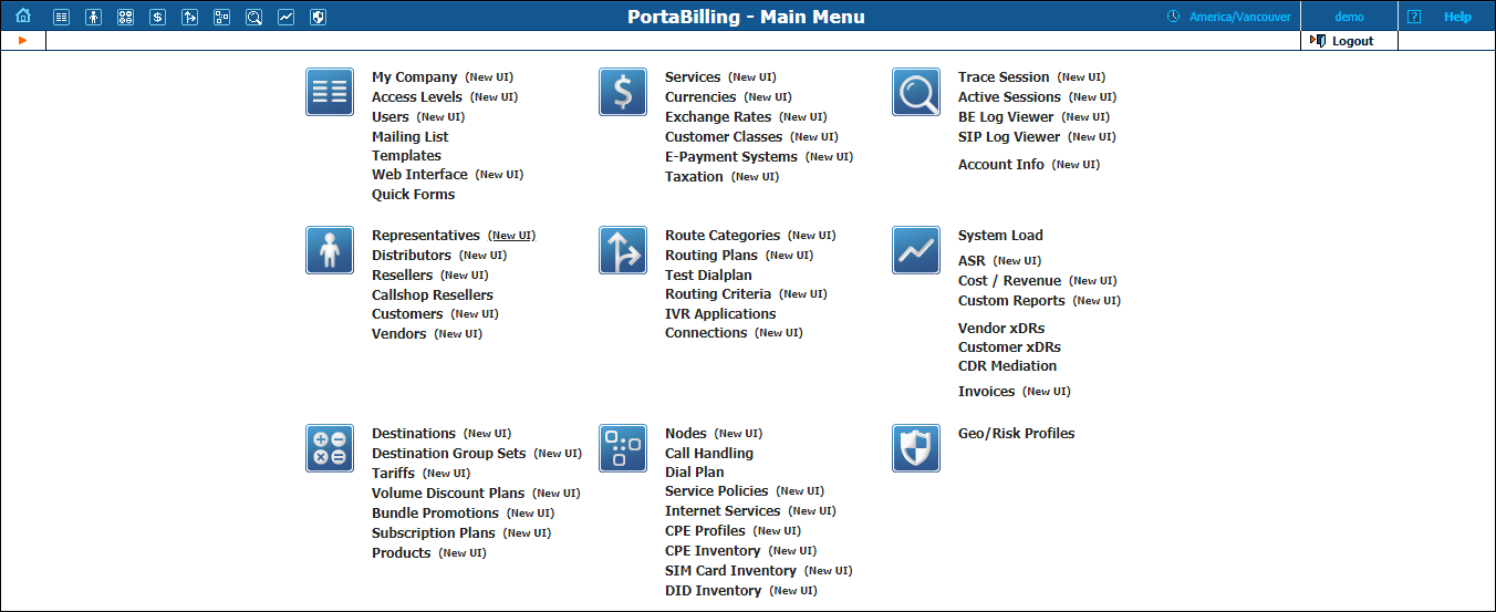
PortaBilling’s front-end design and functionality are simple and intuitive. The web interface of the PortaBilling® home page is the main point of entry to all system objects and tools. Divided into eight functional blocks, the icons below link to pages containing tools for system management, VoIP networking, billing, customer help and generating statistics. Each second-level page contains a link back to the home page.
These are the nine functional blocks:
Management |
Global system maintenance tasks, such as adding administrative users, defining access levels and creating mailing lists, templates and quick forms. |
Billing |
Tasks related to billing, such as managing the list of services provided and the rate plan definition; maintenance of currencies and exchange rates. |
Rating |
Tasks related to charging customers for services, such as managing destinations, destination group sets, tariffs, products and discount plans. |
Participants |
Tasks related to different entities in the system, such as representatives, distributors, resellers, customers, vendors and account management. |
Networking |
Configuration of network components: registering new nodes (network endpoints) in the system; configuration of CPE profiles; tools for configuring and testing call routing. |
Routing |
Configuration of various parameters which affect call routing, and a tool to check how routing will be done for a particular destination number. |
Statistics |
A variety of statistics and reports are available, reflecting the status of the system or providing information on call records, costing and revenue. |
Help Desk |
Tasks available to help desk staff for assistance in troubleshooting problems that clients may inquire about. |
Fraud Protection |
Tasks related to fraud protection, such as configuring geo / risk profiles. |
All of the functions available from the home page (main menu) are also available using the drop-down menus:
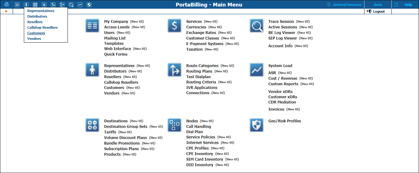
The  Home
icon on the left also contains a menu with shortcuts to all the other
PortaBilling® interfaces:
Home
icon on the left also contains a menu with shortcuts to all the other
PortaBilling® interfaces:
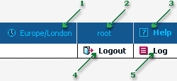
The top right-hand side of the interface provides users with the following information:
The toolbar often also shows a list of available actions relative to the current page:
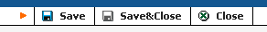
This toolbar acts as the equivalent of the “File” menu for the application, i.e. the usual location for the “Save”, “Close” and “Add” operations.
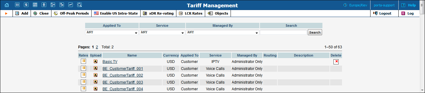
If you see the  Delete icon next to an object name in the list of objects,
this means it can be deleted from the system. Note that only objects which
are not used elsewhere in the system may be deleted. For instance, in
the screenshot below, the DID supplier costs, Prepaid cards
and SIP Phone Subscribers tariffs can be deleted, whereas
the rest of tariffs are being used by some product or connection.
Delete icon next to an object name in the list of objects,
this means it can be deleted from the system. Note that only objects which
are not used elsewhere in the system may be deleted. For instance, in
the screenshot below, the DID supplier costs, Prepaid cards
and SIP Phone Subscribers tariffs can be deleted, whereas
the rest of tariffs are being used by some product or connection.
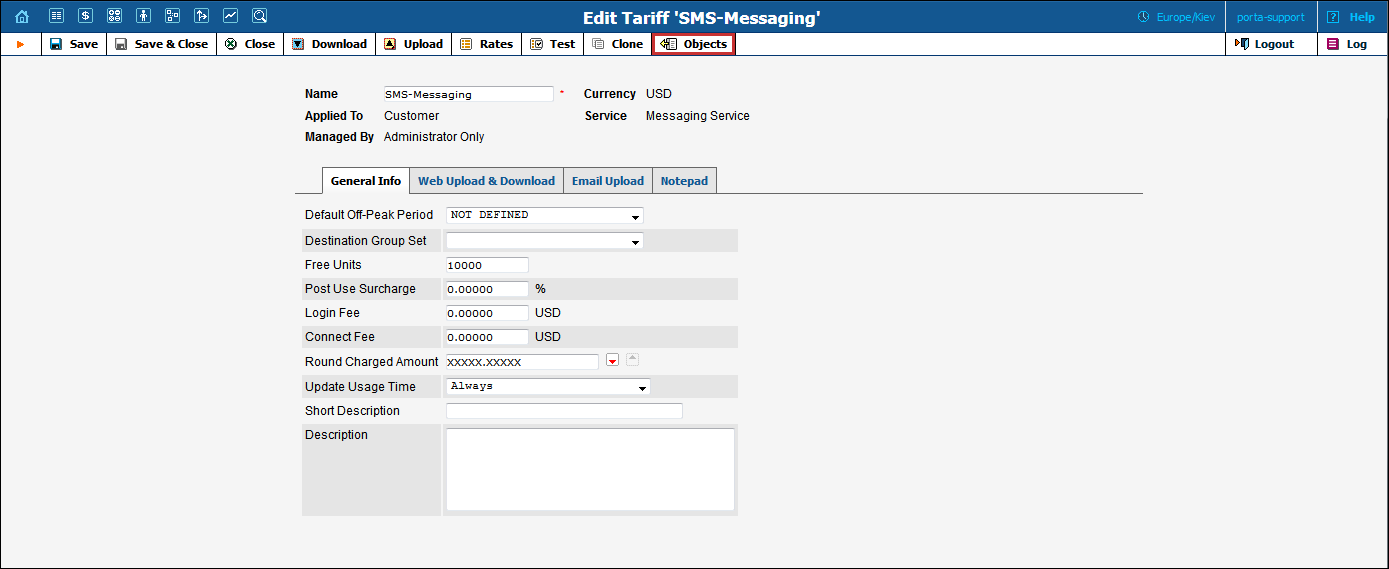
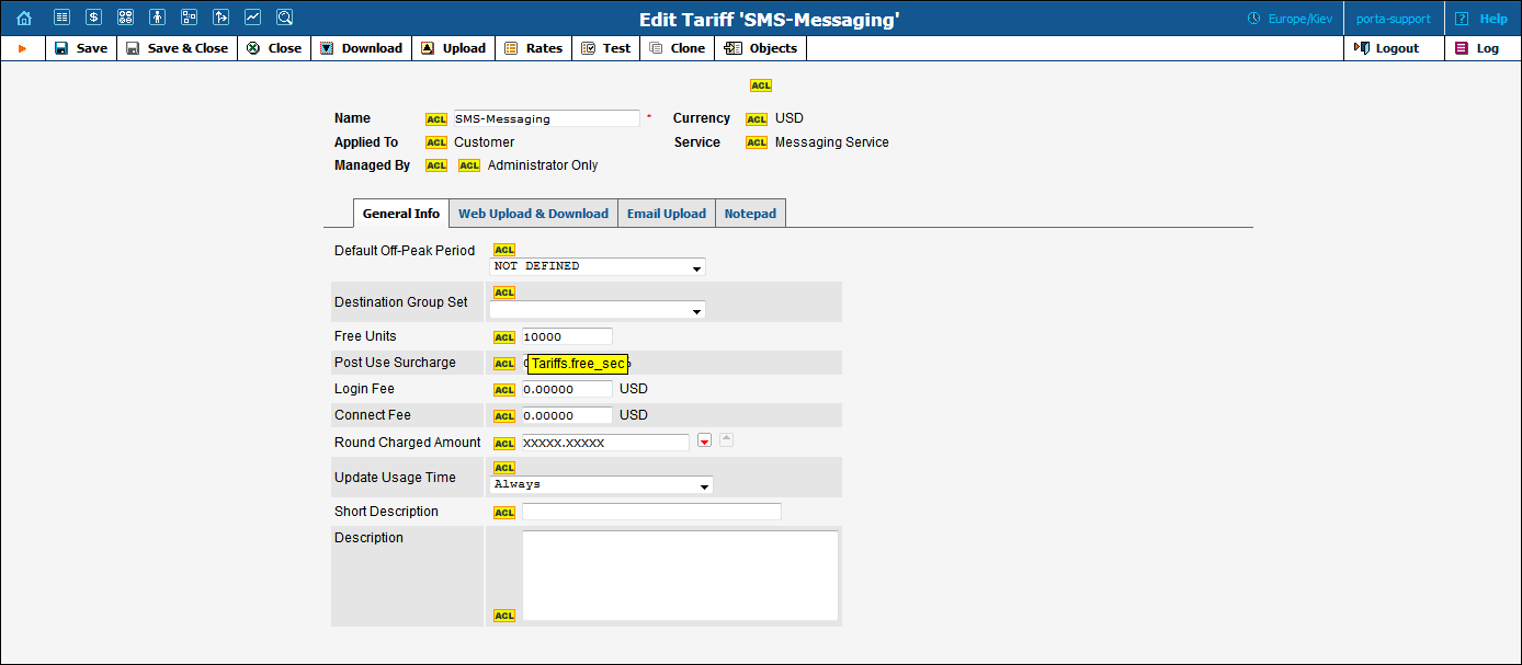
The Objects icon is only available to the Root user; when clicked next to any web element (such as a data field or select menu) it displays an ACL control. Move your mouse over the ACL control for the given element to see the object properties, as illustrated below. These object properties can be used by the administrator when configuring access levels for certain users in the system. See the Access Levels section for more information.
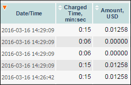
This feature is available for all xDR browsers in order to sort the displayed information according to different criteria, where necessary. The table header cell with the orange triangle shows the sorted row. A triangle pointing downward indicates descending order, while a triangle pointing upward means ascending order.
Sorting is available for all columns with a bi-directional white arrow in the top left-hand corner of the header cell. To sort a column, simply click on the header; click the same column again for the opposite sorting order.
Another handy feature for sorting tables is that the table header is always visible, even if you scroll to the bottom of a large table which does not fit completely on the screen.
Some forms (e.g. customer or account information) contain so much information that it is not feasible to display it all on a single page. The standard practice in this case is to divide the information between multiple tabs, each of which contains only a portion of the information and can be individually selected for display. To provide a better user experience with a high number of tabs, PortaBilling® provides two rows of tab controls.

When you click on a tab’s name, it is selected (black font on a white background) and you can see the associated information. Note that even if a tab from the upper row is selected, the row order does not change, and all the tabs stay in their original location. Thus you can always remember where a particular tab control is located on the form; see below for an example where a tab from the upper row has been selected.
In the bottom left corner of the main menu page, you can see information about the maintenance release and build of the software currently installed, e.g. MR54-1 means “Maintenance Release 54” and “Build 1.”


